
The Americas use what is called “traditional color theory,” which comes from 18th-century European painting: red, yellow, and blue are the primary colors. Colors sit on a wheel that shows how they mix and which pairs contrast most. Black and white sit outside it, at opposite ends of a light-to-dark scale. Printers use cyan, magenta, and yellow (CMYK); screens use red, green, and blue (RGB).
Vision science describes a different set of primaries: the eye pairs red against green, blue against yellow, and black against white.
Indigenous systems in the Americas assign colors to places instead.
Maya assigns a color to four directions and to the center: red east, white north, black west, yellow south, blue-green center. Red and black stand opposed — sunrise against sunset, birth against the underworld.
Cherokee assigns a color to each of seven directions, and each direction a season: red east and spring, blue north and winter, black west and autumn, white south and summer, plus yellow above, brown below, green center.
Diné (Navajo) assigns four, one to each sacred mountain: white east, blue south, yellow west, black north. In the language, one word covers both blue and green.
North America
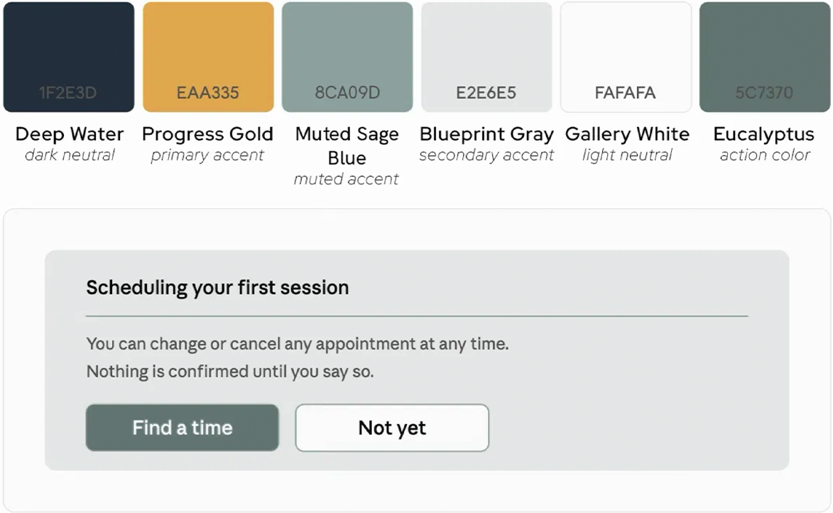
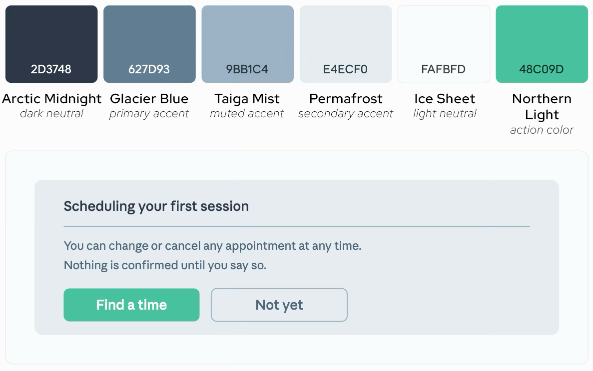
Latin America
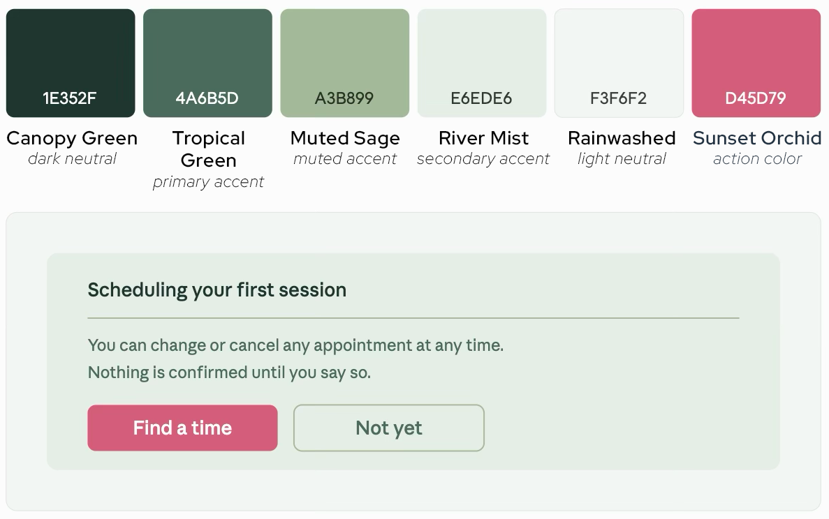
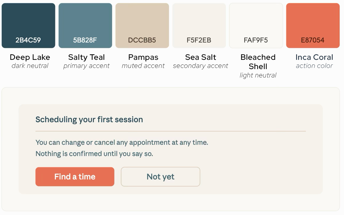
Caribbean
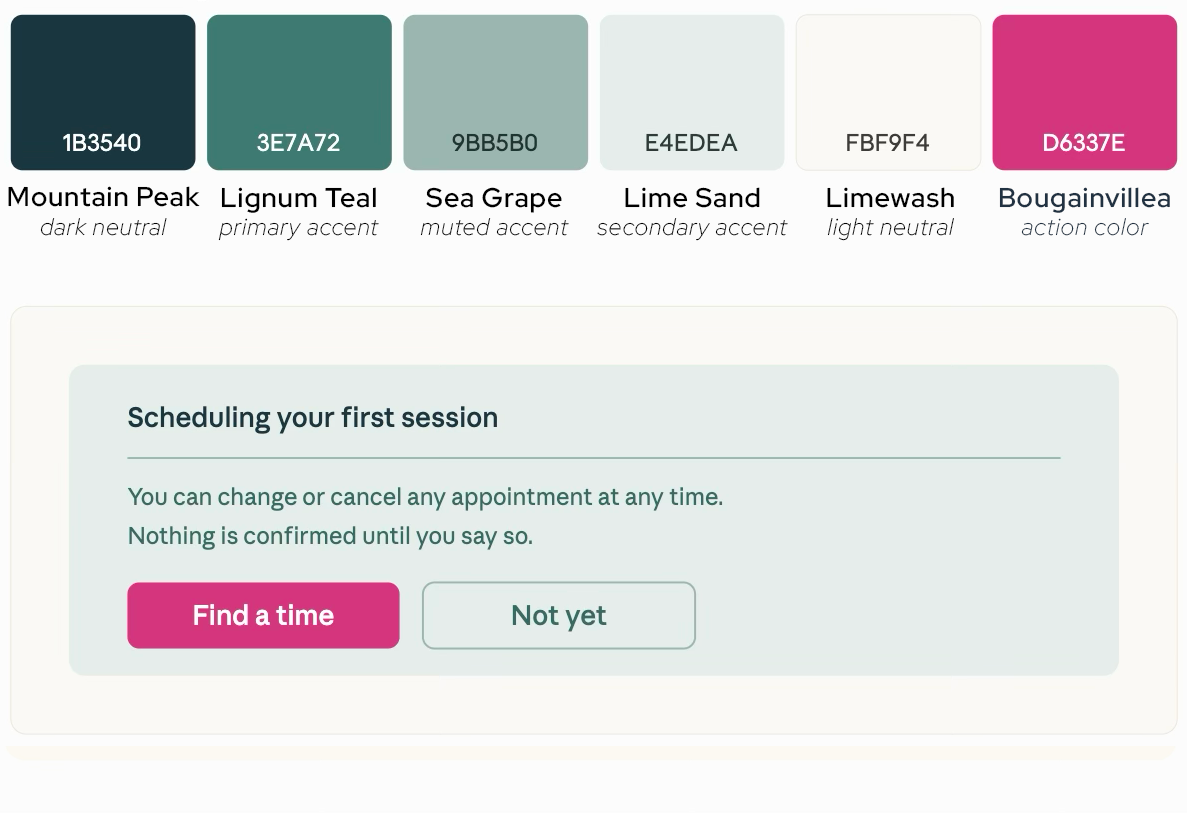
Read about choosing colors for your healing practice.
Why Choosing Your Brand Colors Is ImportantRead about how to make your website appropriate for trauma-informed communication
Graphic Design Techniques For a Trauma-Informed PracticeSOURCES
Trauma-Informed Colors
Palmer Home for Children. Designing a Healing Home: Decorate Your Space With Trauma-Informed Principles. Aug 2023
Rose Have. Trauma Informed Design: Inspiring Safety & Healing. Aug 2024
Eden Environments. Trauma-Informed “The Impact of Color on Emotion: Choosing the Right Hues for Healing Spaces” Jul 2023
JLG Architects. Trauma-Informed Design, New Directions in Health Care Architecture. Jul 2023
Little Brick Lane. Design When You’re Healing: Soft Tones, Easy Textures, and Safe Shapes. May 2025