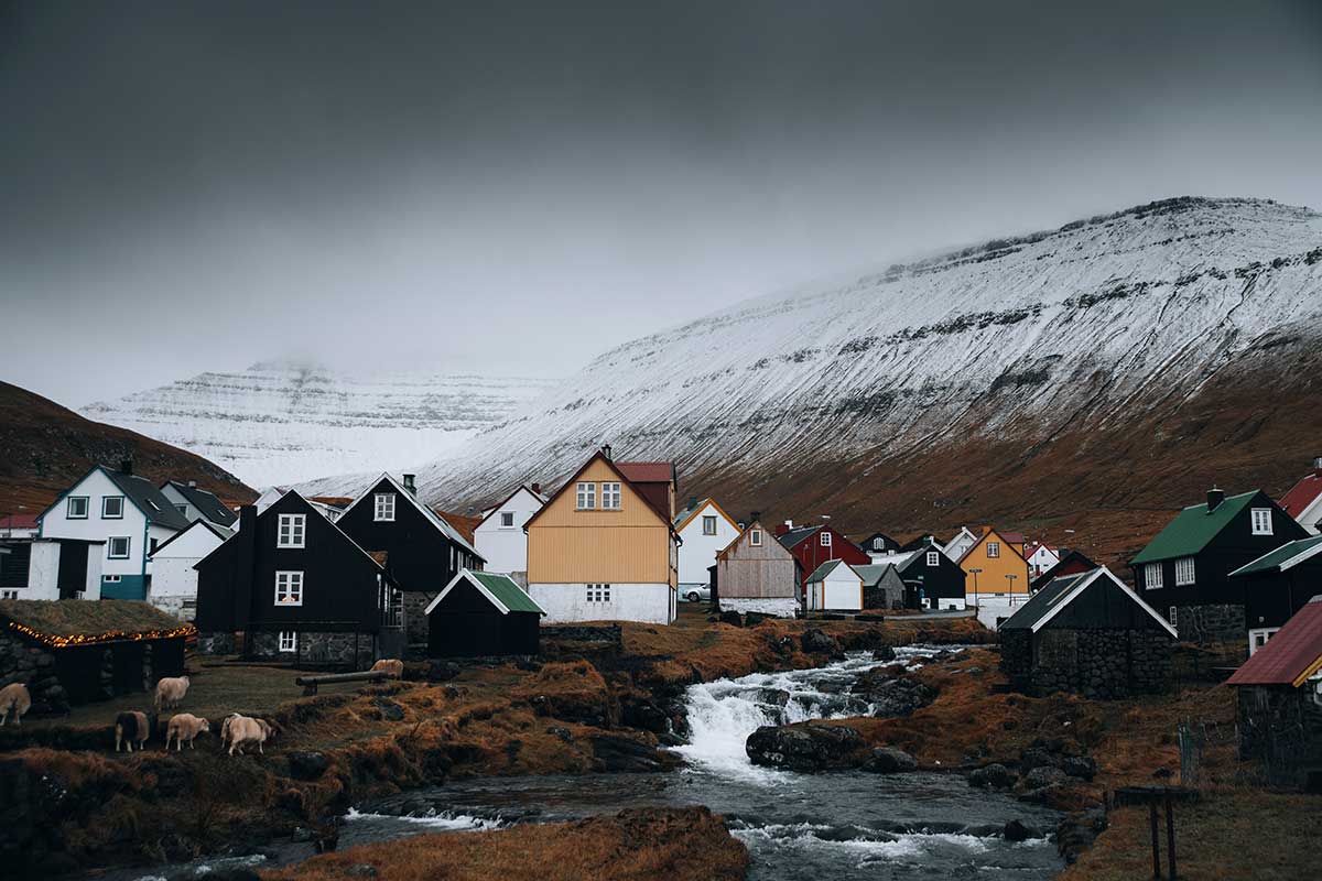
Europe
The color wheel comes from here. Newton bent the spectrum into a circle in 1704, and 18th-century painting theory settled on red, yellow, and blue as the primaries.
Europe’s older systems don’t use it.
Heraldry sorts colors by light and dark instead of by hue. Gold and silver on one side, red, blue, green, black, and purple on the other. Anything placed on a shield had to come from the opposite group: a gold lion on blue, never black on blue. The rule was written down by 1568, and it exists so a coat of arms stays identifiable at distance in poor light.
Russian has no word that covers all of blue. Light blue and dark blue are separate colors with separate names, the way English treats pink and red.
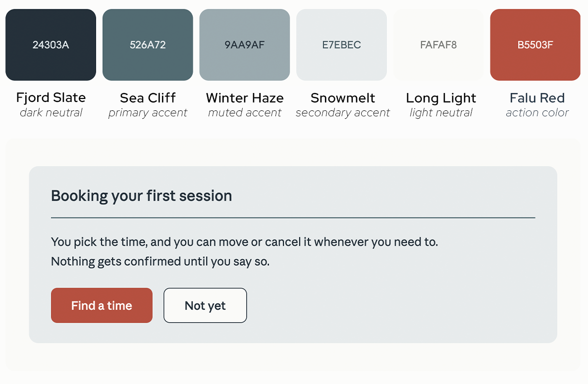
Northern Europe
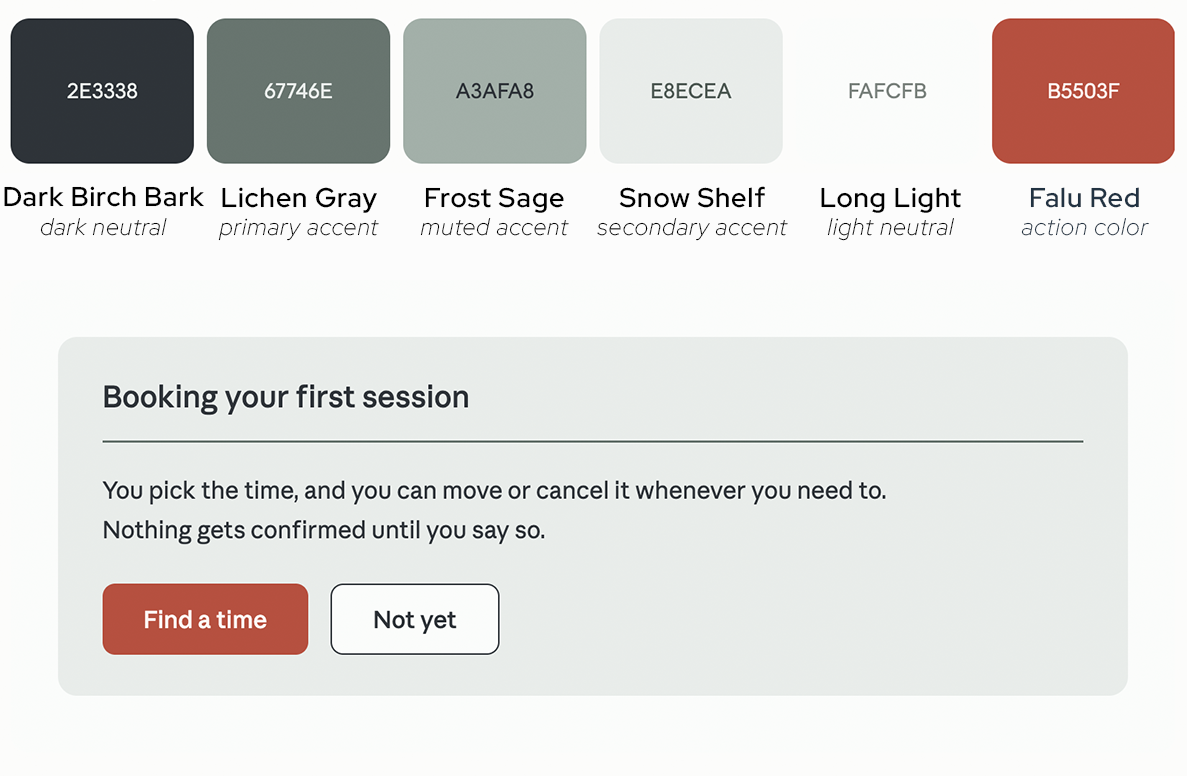
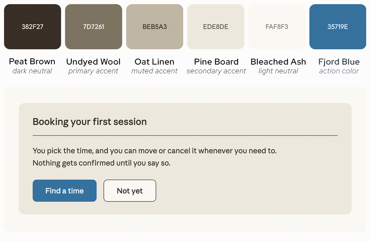
Western Europe
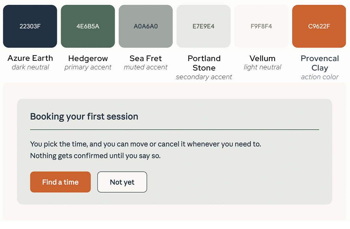
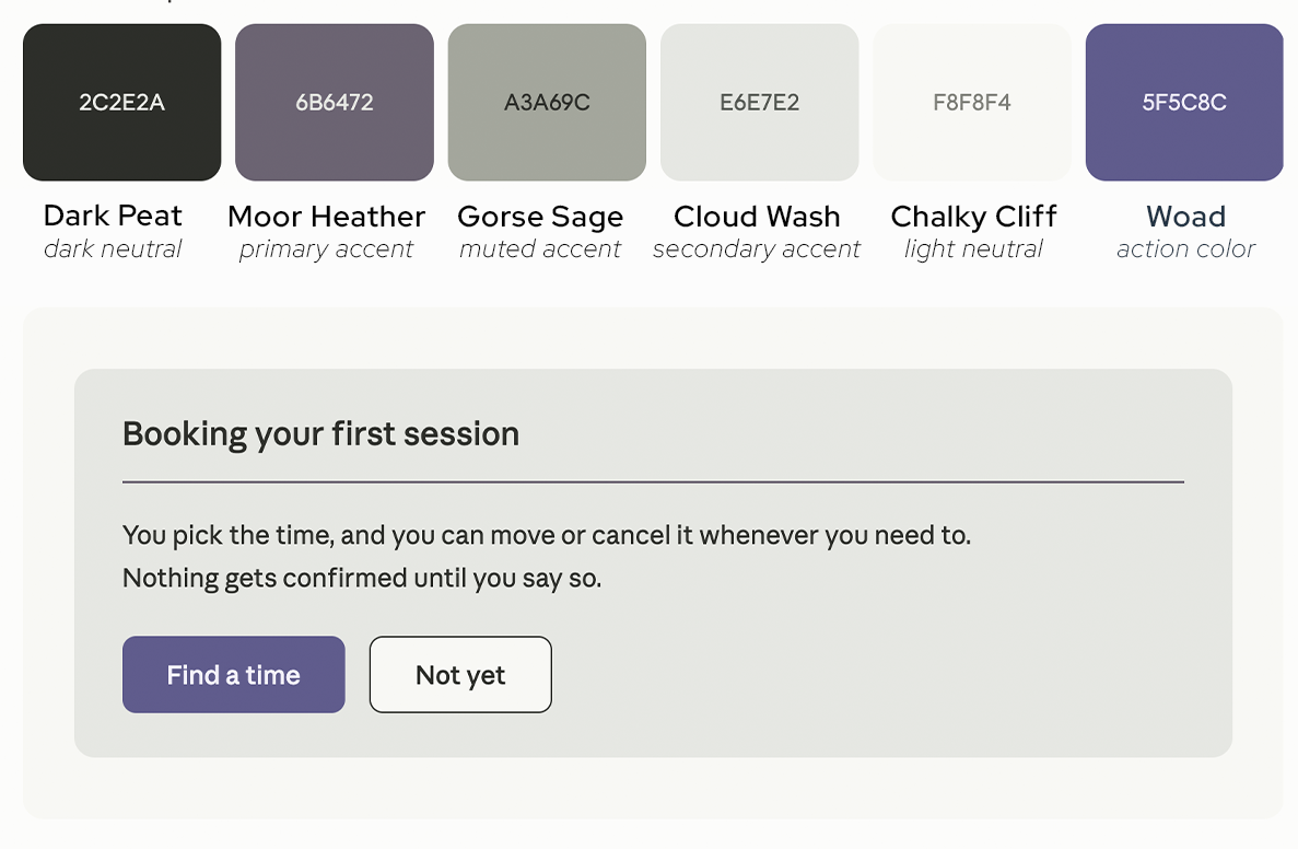
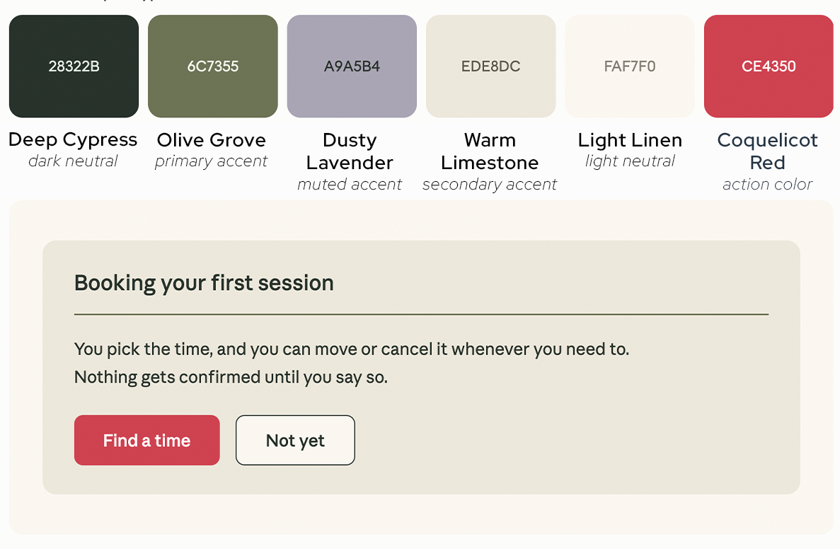
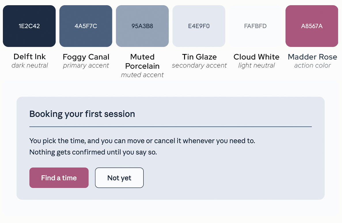
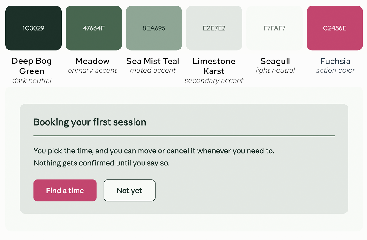
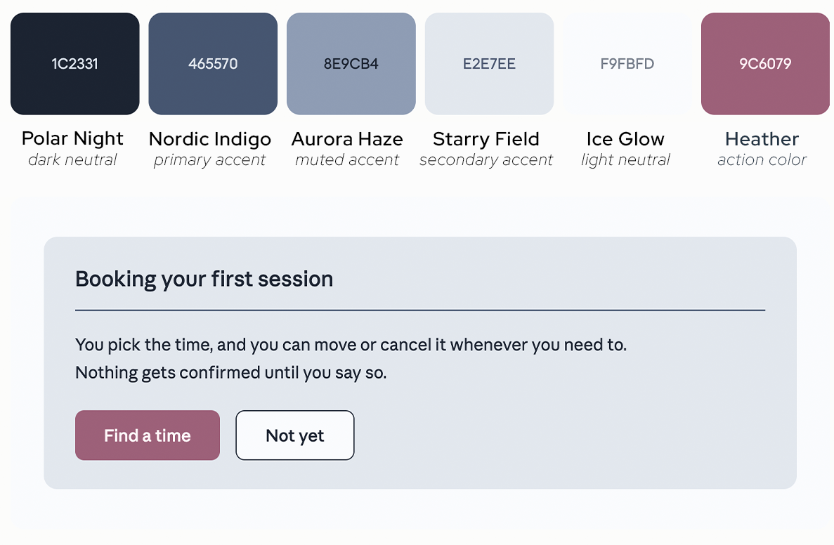
Central Europe
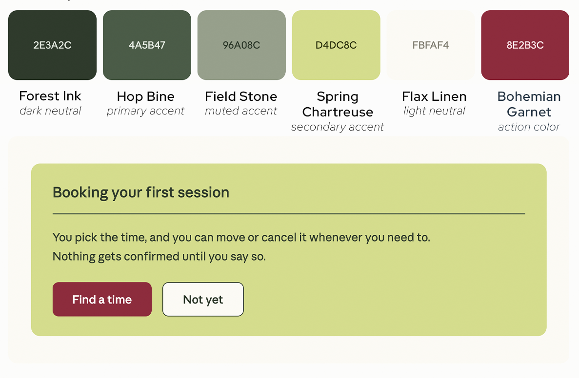
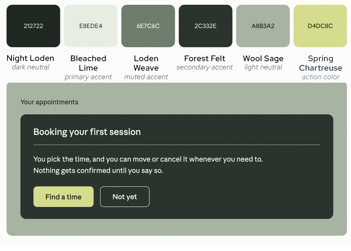
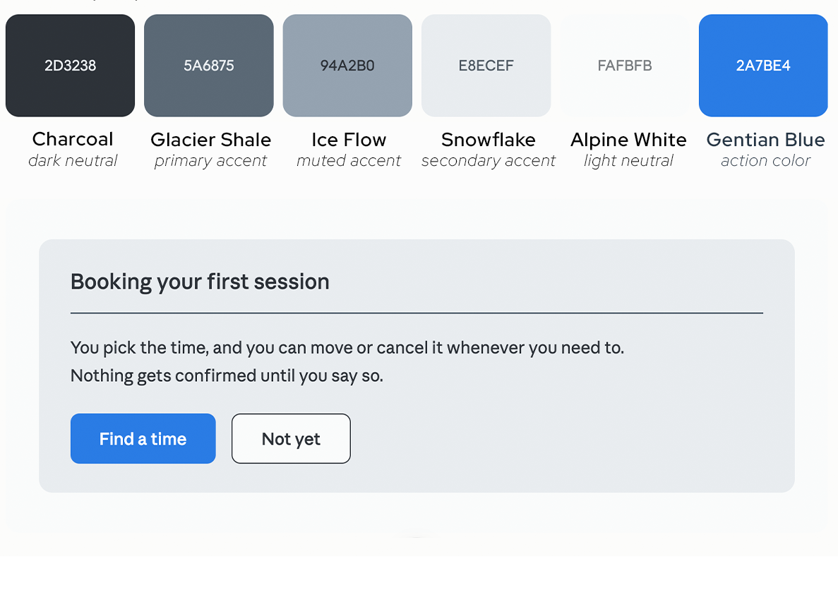
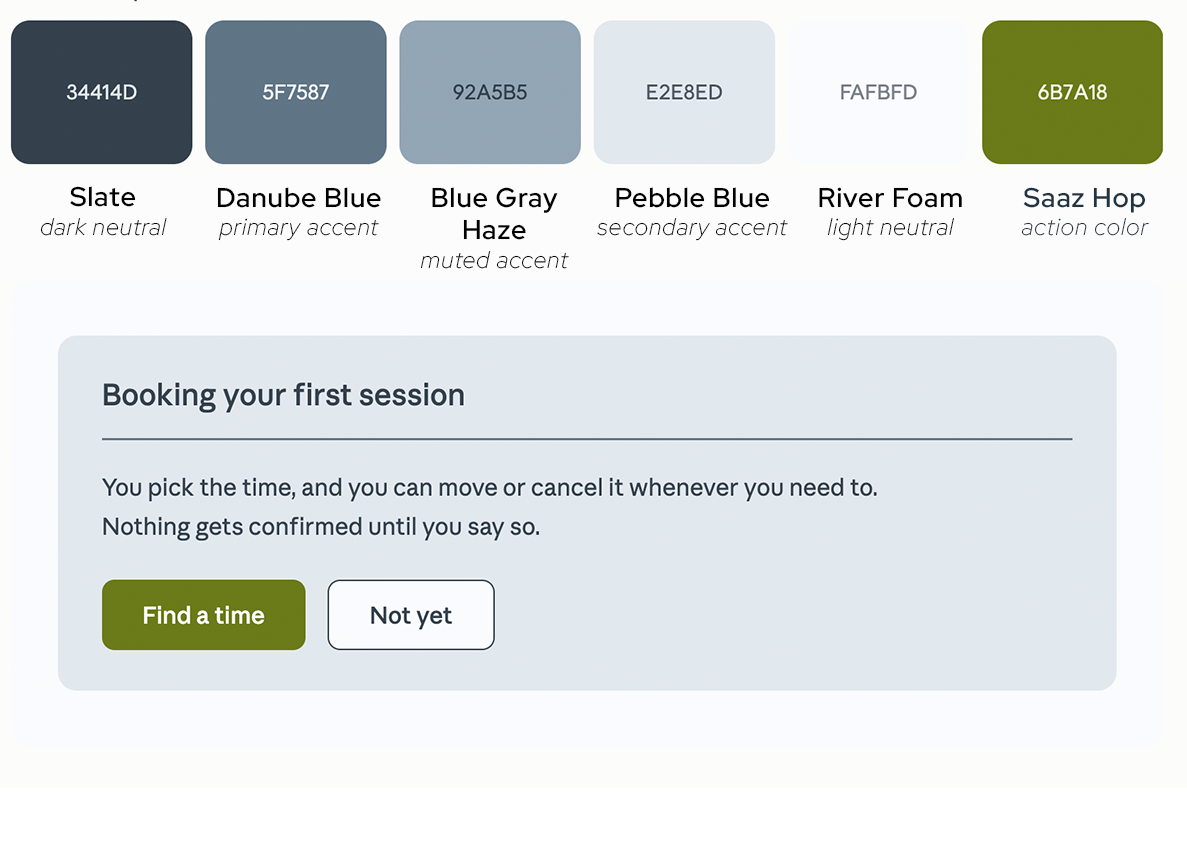
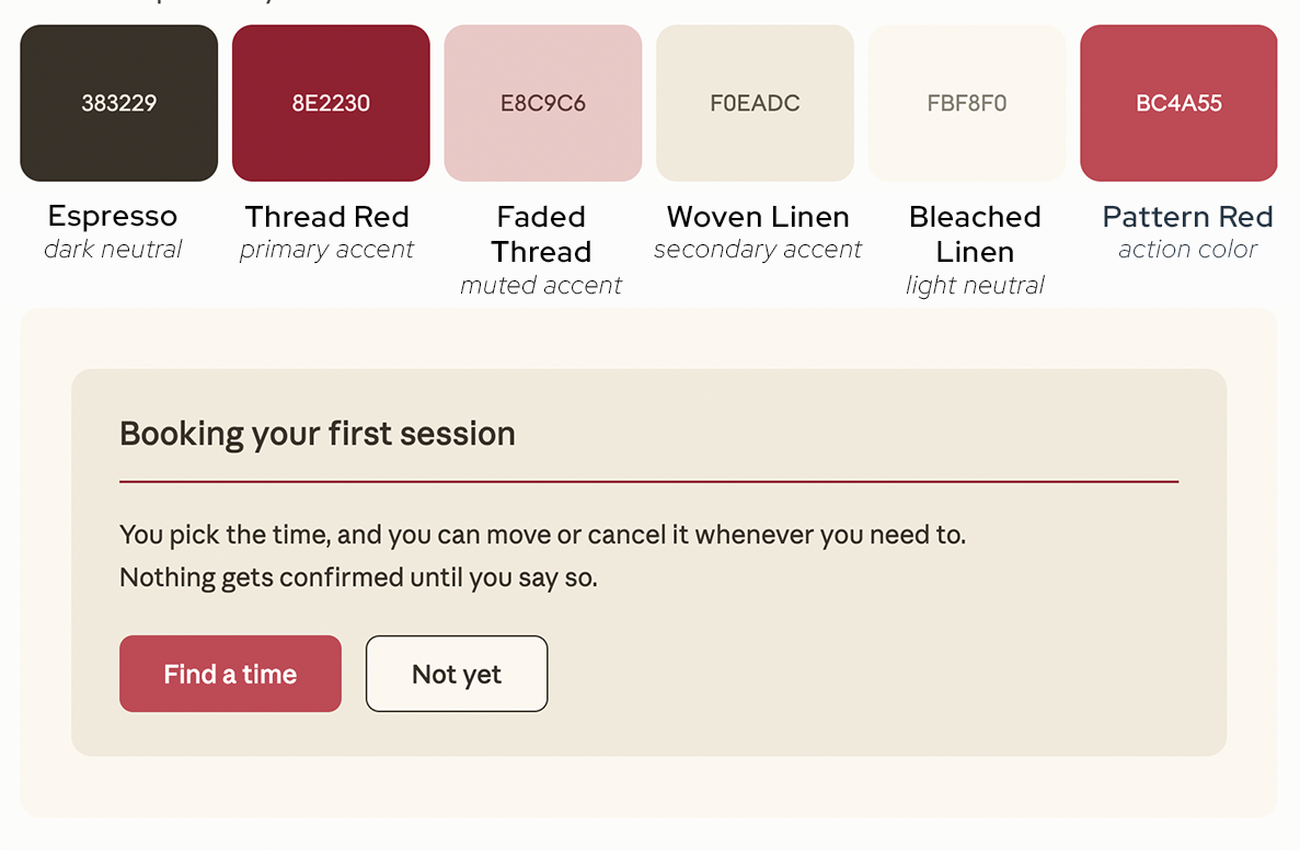
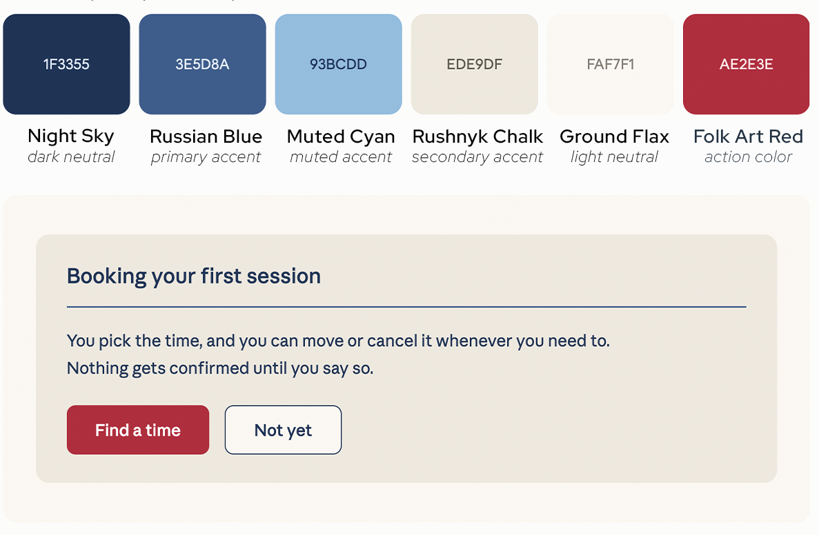
Eastern Europe
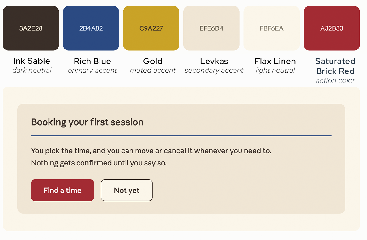
Read about choosing colors for your healing practice.
Why Choosing Your Brand Colors Is ImportantRead about how to make your website appropriate for trauma-informed communication
Graphic Design Techniques For a Trauma-Informed PracticeSOURCES
Trauma-Informed Colors
Palmer Home for Children. Designing a Healing Home: Decorate Your Space With Trauma-Informed Principles. Aug 2023
Rose Have. Trauma Informed Design: Inspiring Safety & Healing. Aug 2024
Eden Environments. Trauma-Informed “The Impact of Color on Emotion: Choosing the Right Hues for Healing Spaces” Jul 2023
JLG Architects. Trauma-Informed Design, New Directions in Health Care Architecture. Jul 2023
Little Brick Lane. Design When You’re Healing: Soft Tones, Easy Textures, and Safe Shapes. May 2025